
Measuring year-over-year growth in your analytics data is oftentimes much more important than month-over-month traffic trends, especially if your business is seasonal. But even for non-seasonal sites like yours truly’s, it’s good to get the 100-foot view of how your site is performing compared to the same time last year.
Here’s an example of how you can chart your year-over-year traffic and even include a line chart with the percent delta data.
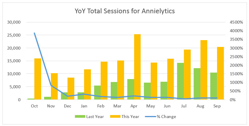
Custom Report Featuring the Month of Year Dimension
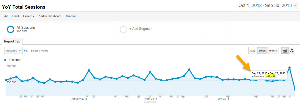
The video demonstrates how to create the custom report in Google Analytics that uses the Month of Year dimension. One great thing about this dimension is that, even though you’re working with a custom report (which is normally subject to sampling) the Month of Year dimension doesn’t trigger sampling.
You can see in the report below that I applied this custom report to a view that hits 500,000 sessions (where sampling begins) in less than two weeks. And yet I was able to pull a year’s worth of sessions without sampling.
File Download
If you’d like to download the file I worked from you can download it here.
Leave a Reply