
Histogram charts are great tools for marketers, but unfortunately Excel doesn’t make the process of creating them terribly intuitive. But I’ll try to simplify it for you a bit.
Why A Histogram?
Histograms are good for summarizing data into groups. Think about a teacher who has given a test and wants to know how many A’s, B’s, C’s, D’s, and F’s there were in her class. Or a manager who wants to know a breakdown of how long each of the company’s employees have been employed with the company. Or a customer service manager who needs a breakdown of time site visitors spend waiting for a chat representative.
All of these use cases would be ideal for a histogram.
The trick with creating a histogram is you start with a detailed data set but then discard the details, figure out the breakpoints for each of your categories (or bins if you really want to impress that special someone at the bar), and then use the FREQUENCY function to count the (you guessed it!) frequency of items in each of those categories.
To use a histogram you need to have a data set with lots and lots of numbers. Then you’re going to take those numbers and figure out breakpoints for your groups. So in our teacher example, the bins would be the numeric grades — e.g., 100, 89, 79, 69, 59 — not the letters. And the frequency would be how many students achieved each of those grades. So we no longer care about the individual students; we’re getting more of a bird’s eye view of the performance of the entire class. Make sense? Great!
Practice File
You can download the Excel file I used in the video from Dropbox here.
Steps
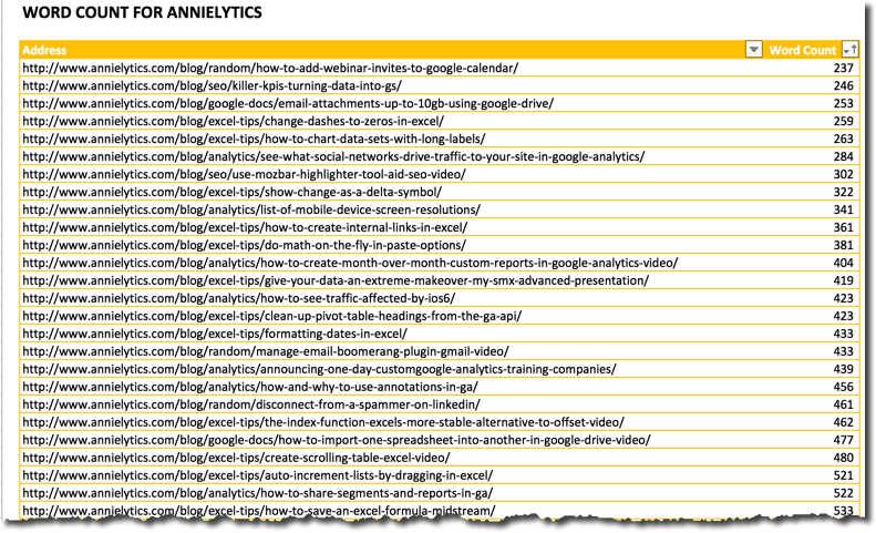
I took a list of blog posts from my site that I ran last year in Screaming Frog and wanted to see a distribution (got tired of writing “breakdown”) of my word counts.
Step 1: Prep Data
I first removed irrelevant URLs (e.g., non-blog posts) and then removed the rest of the data from Screaming Frog.
Here’s what my original data set looked like.
Step 2: Create Bins
Break your data into bins. I sorted my data set in descending order from the table, and figured out categories that made sense, which broke down to:
400
600
800
1000
3000
5000
12000
Step 3: Write FREQUENCY Function
Create a column that you call Frequency (or whatever makes sense to you). This is where you’ll enter the FREQUENCY function, which is an array function so it gets some red-carpet treatment most functions don’t get. To wit, you’ll actually select the empty cells in that column, enter an = sign followed by the formula, and then press Ctrl-Shift-Enter (Mac: Command-Shift-Return) to execute the function.
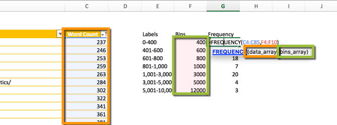
Step 4: Create Labels For Chart
Your Bins column, which just contains the max of each of the categories, doesn’t usually translate to labels too well. So I created a separate column for what would become the chart labels and labeled it … “Labels”.
Don’t worry: It doesn’t actually show up in the chart.
You can see what may labels look like in the screenshot for step 3.
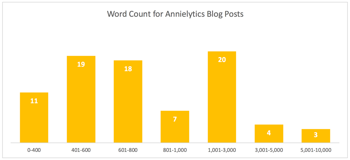
Step 5: Create The Chart
To wrap up the tutorial, I created a chart from the raw data using the Labels and Frequency columns. If you want to learn how to create a minimalist chart like what you’ll see in the sample file (and the screenshot below), check out my comprehensive tutorial on creating and sexying up charts in Excel.
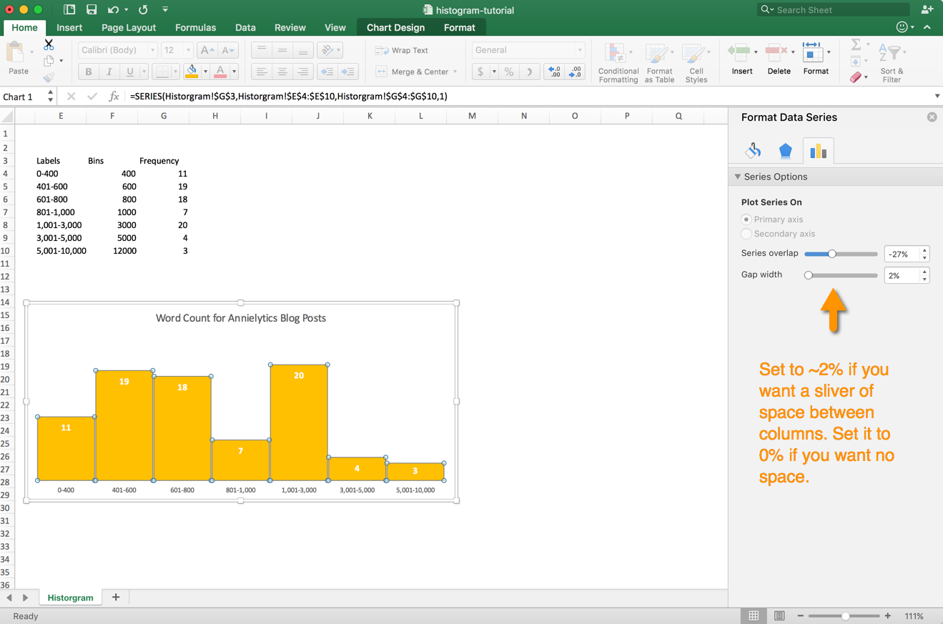
If you want little or no space between your columns, you can modify the Gap Width. Just click one of the columns once, and the Series Options panel will pop up. (If you’re working with an older version of Excel, press Ctrl/Command-1 to access formatting options.)
Video
Dashboards
If you want to learn how to build out interactive dashboards in Excel using Google Analytics data, check out my dashboard course for marketers.
Nice one