Filters
- The 'Chain agents' category encapsulates 'agentic AI' and 'mixture of agents' (aka 'mixture of experts').
- I sorted the task checkboxes alphabetically because there are so many of them, but I sorted the benchmark checkboxes to compare by popularity. Also, many AI leaderboards only include quality benchmarks.
- You can share links to the filtered dashboard because your filter options are captured in the URL.
- I will be building this tool out as I add more tasks. If you have a suggestion or want to report a 🦟,
hit me up! 👊.
- You can learn how to use this app
here.
- If you see a handle on a tooltip, you can drag it to reposition it in the canvas. It took hack on top of hack to suppress the JavaScript library's default tooltips and get these interactions to work in a responsive fashion for both click and touch interactions, so if you run into any issues please
let me know. Please include the device you experienced the aggravation on and version.
- The more options you choose, the more complex the visualization will become. I'd recommend selecting no more than three options from each group—and fewer if you're working on a small screen.
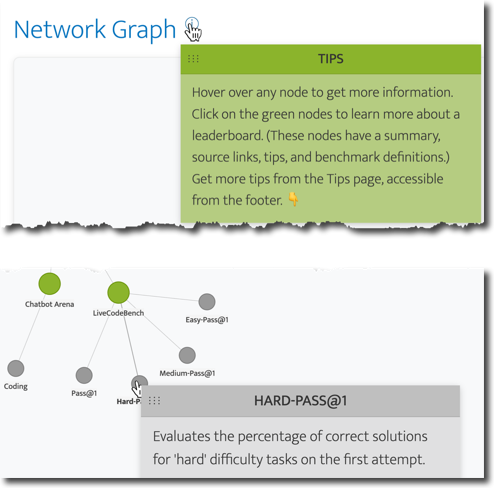
- You'll see quite a few references to nodes, which sounds super 🤓. A node in this context is a 🔵 in the network graph you will generate.
- Where most data sources refer to continuous variables as 'metrics' or 'measures', in the world of model performance the term du jour is 'benchmarks'. So I go with that throughout this tool, but if that term gives you the eebie jeebies, just think of them as garden-variety metrics. Sometimes these benchmark leaderboards also include categorical variables, e.g., model type (open model or proprietary), evaluation date, etc. However, this tool focuses primarily on the performance measurements, while pointing out some of these additional segmentation options in the tooltips for a leaderboard. (See the tooltip in the Network Graph section to learn more about how to access and use the leaderboard tooltips.)
- You can update your selection after generating the graph. Just click the 'COMPARE MODELS' button to update the visualization.
Leaderboards
- A leaderboard is just a dashboard with various ranking systems that compare different AI models based on how well they perform on specific tasks. Think of it like sports rankings where teams are ranked based on their win-loss records.
- The learning curve for using leaderboards is quite high. It doesn't help that they tend to approach assessing models quite differently. Then there are the analysis challenges associated with comparing performance across models, e.g., some leaderboards provide charts where most just provide tables. Some at least add interactivity to the table (e.g., the ability to sort by different columns), while others don't. 😶 Additionally, many test common use cases like chat, where very few test things like a model's ability to handle multiple agents or interpret videos.
- Sadly, most leaderboards don't provide tooltips letting you know what a benchmark metric actually tests, which is the issue that makes leaderboards most difficult to work with, imo. So I started out with a Google Sheet with definitions of common metrics but eventually decided to create an interactive tool to try to reduce the learning curve and bring AI strategy to the masses.
- These leaderboards change their format and even structure quite frequently. From the time I wrote the instructions to the time I QA'd (which was the span of about six weeks), features had been added to some leaderboards and some had gone missing altogether. If I didn't include very specific instructions on where to find these menus, filters, search fields, etc., I would've wasted time trying to find options that had just gone 🪄🐇🎩. If you find information that's outdated, please
let me know. (You won't be added to a mailing list.)
Network Graph
- Depending on how many options you selected in the form, the dashboard can get quite complex and unwieldy. If node clusters are overlapping, in addition to being able to reposition them, you can also zoom in and out using your mouse wheel (or its equivalent) and increase the size of the canvas by dragging the bottom edge of the chart. (Look for the 5 dots.) If you make the canvas larger with the resizer handle, you'll want to zoom out a bit to reposition the graph.
- If your nodes get a little tangled, I've found that giving a hard tug on a leaderboard node (the green ones) will generally be enough to detangle the clusters. I find rearranging them to be a bit of a catharsis. 🧘
- If you don't like the angle of the graph after filtering, you can adjust it with the Orientation slider to make it more 📸 worthy. I've found it's best to adjust the angle after detangling your nodes though because the orientation changes with every modification. I added this feature because the haphazard positioning of the nodes vis-a-vis the hub drove me to distraction. I have to have the hub node at the top of the chart. If the chart gets floaty on you after your tweak, just click-and-drag the canvas (i.e., pan) to corral it back to the center.
- When scrolling down the page, be careful to move your mouse to the right or left of the graph as the mouse wheel controls the zoom level of the chart.
Search
- You can search nodes using the search field. Any node with a match will retain its full opacity, and nodes that don't contain a match will fade into the background, like me at a mixer before I take my first sip of liquid courage. 🍹
- If you open a leaderboard node that has a match, your search term will be highlighted. Some of these leaderboard nodes have a lot of text, so the highlighting is intended to save you some time so you can get back to more important tasks, like doom scrolling.
- If you want the search to include all tasks (i.e., all nodes), activate the toggle. If the app finds matches beyond the tasks you selected in the form, the app will add those nodes, but the edges (i.e., connecting lines) will be dashed. In most cases, these added nodes will be subsets of the task node(s) that were added (i.e., not all of the leaderboard nodes), which is why they're styled differently. Deactivate the toggle to remove them.
- Closing out of the search will return the nodes to full opacity. If you want to search for a new term across all tasks, be sure to deactivate the toggle before searching again. I've duct taped multiple JavaScript libraries together to achieve the level of interactivity I wanted, which comes with risks. At the time of publishing, not deactivating the toggle first sometimes causes nodes to peace out and float off the screen. 🔵👋
- Because the leaderboards introduce the most complexity to AI strategy, I went through each one listed in the visualization and compiled a list of tips. You can view those, as well as other important details, by clicking on a leaderboard node (the green ones). In addition to the tips, these modals provide links to the website for that leaderboard as well as its methodology page (which is usually an Arxiv paper). I also provide a list of the benchmark metrics that leaderboard provides, so you don't have to hover over each benchmark node.
- I try to let you know leaderboards that also include charts—like the Artificial Analysis leaderboard—because, in general, charts are easier to interpret than tables. AA's bubble charts (which just add a size parameter to a scatterplot) are especially helpful in seeing how models compare across a variety of benchmarks because they allow you to compare three metrics at once (e.g., quality, cost, and speed). But there's a tool that makes Artificial Analysis data even sexier, and I refer to it a lot. It's called the What LLM Provider leaderboard, and its approach to visualizations is really clean and elegant. You just need to check out the last updated date at the bottom of the page to make sure the data isn't too outdated. If you know anything about me, I'm a big fan of wildly interactive dashboards (example from one of my own tools and my Making Data Sexy book series).
- You can share links to filtered versions of the dashboards because your filter options are embedded into the URL. The only thing that's not are search terms.
- If your visualization gets too floaty, I find that panning the dashboard and/or zooming will tend to stop nodes from getting too crazy.
- Approach model creators' performance claims with a grain of salt. For example, if a model claims its updated model scored well using the MMLU benchmark, here's how I process that claim: I first search this tool for the benchmark, then click through to leaderboards that include that benchmark. If I don't see the model on any of these lists, I take note because it could mean its creators didn't submit their shiny new model to be evaluated by the team that manages the leaderboard. (To be fair, sometimes that's not even an option; all the data in the leaderboard is self-reported. Ugh.) Then I look at the only leaderboard I know of that flags models suspected of cheating (aka 'model contamination'). If I see other models from that creator highlighted in red (*cough* Qwen *cough*)1, in my mind, it's strike 2. Finally, I look at the MMLU-Pro and MMMU leaderboards to see if these model creators tend to self-report. In my mind, that's the trifecta. Imagine applying for college and telling prospective schools what you scored on your last SAT practice test. Unless that school is on the brink of bankruptcy, it's not going to fly. Same with models self-reporting their 👋 amazing 👋 performance scores. I wish all leaderboards disclosed models that self-report and/or demonstrate signs of model contamination to bring more transparency to some of their grandiose claims on launch. Until that happens, exercise caution in making decisions on any claim you can't verify.
- I will be building this tool out as I add more tasks, leaderboards, and benchmarks. If you have a suggestion or correction, please
let me know.
Tutorial
Learn how to use this app in
my announcement blog post.
Back to the app
Note: Returning to the app with this button will clear any filters you applied. If you want to preserve your work, use your browser's back button.